urs schmidt design is a Swiss office specializing in visual identity, corporate publishing and art direction for brands, companies and institutions that value design as a success factor.
Clients
Visual identity
Corporate publishing:
Visual identity
Nestlé
Corporate logo
Vertical version
Logo redesign
original (1995), redrawn
Horizontal version
Horizontal version
Vertical version with corporate slogan
Horizontal version with corporate slogan
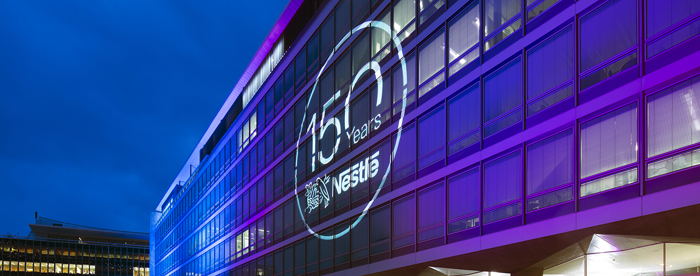
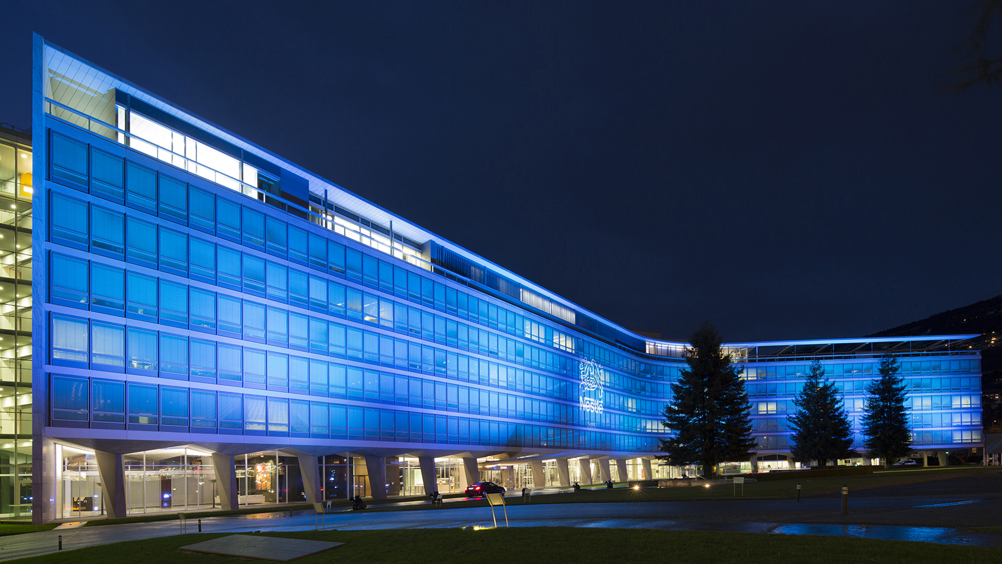
Nestlé headquarters, Vevey, Switzerland
Overview
Since 1866, the Swiss multinational Nestlé – whose name derives from its founder, Henri Nestlé – has a bird’s nest as a logo with three, then two fledglings fed by an adult bird. On the occasion of its 150th anniversary, the company undertook the study of the renewal of its logo.
urs schmidt design was appointed by Nestlé to develop the new logo. A key element of the specifications was to redesign the logo while preserving the legacy of the original. The meticulous work of the drawing of the nest and great attention to detail made it possible to obtain the desired result. Furthermore, Nestlé’s wordmark has been refined. At the same time clearer and more assertive, the new logo is easier to read on electronic means of communication and more endearing, which reinforces the emotional connection with the brand. It reflects the company’s heritage and expresses its modernity.
Visual identity
Nestlé
Logo
150 Years’ Anniversary Logo Vertical version with corporate slogan
Compact version
Compact version with containment
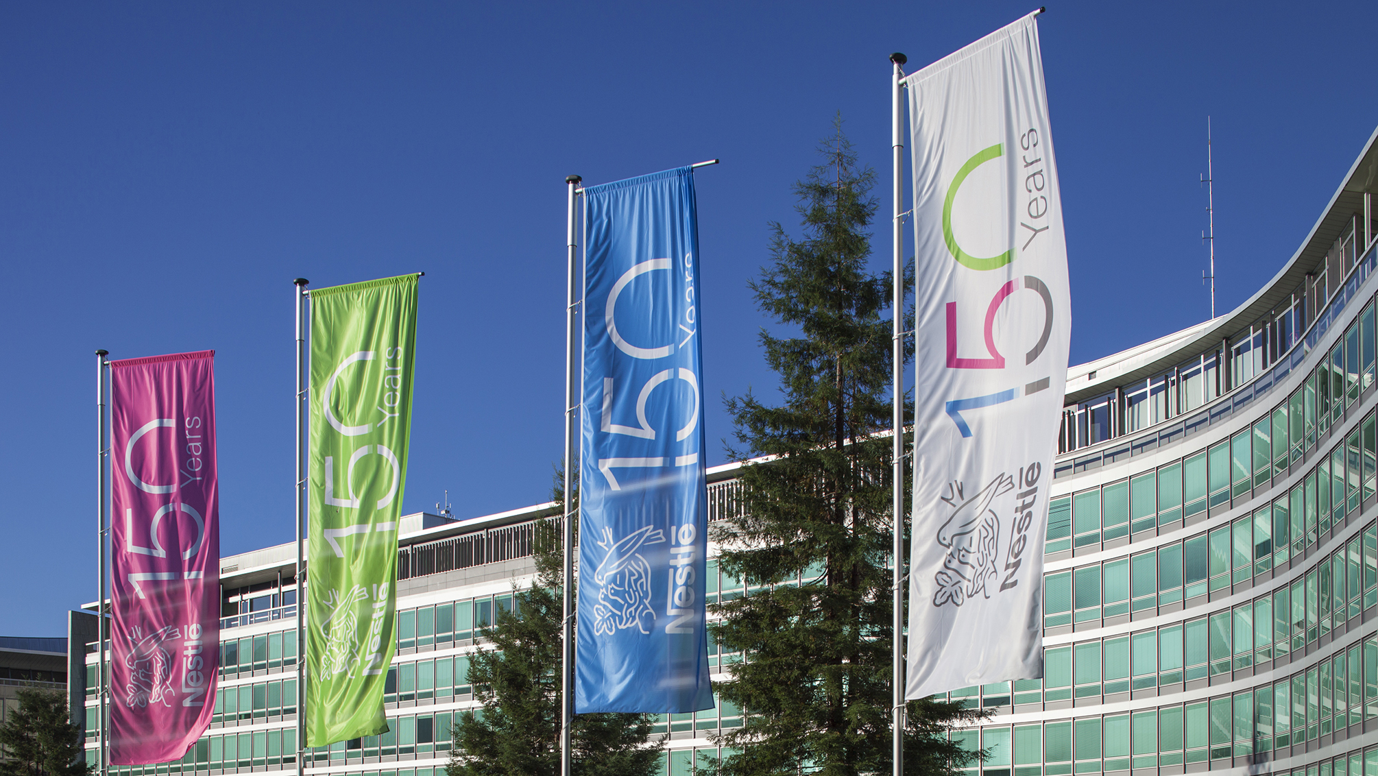
Nestlé headquarters, Vevey, Switzerland
Overview
To mark its 150th anniversary in 2016, the Swiss company Nestlé committed to the creation of a “Nestlé 150 Years” logo that would reflect its past, present and future.
Following different propositions for the project, Nestlé selected urs schmidt design to create the logo. The original combination of Nestlé’s logo * with that of the “150 Years” and the use of intense colours gives the new logo its shape and coherence. With its unique visual impact, the Nestlé 150 Years’ Anniversary logo is an invitation to celebrate this anniversary.
* The new Nestlé logo was also developed by urs schmidt design (see previous page).
Visual identity
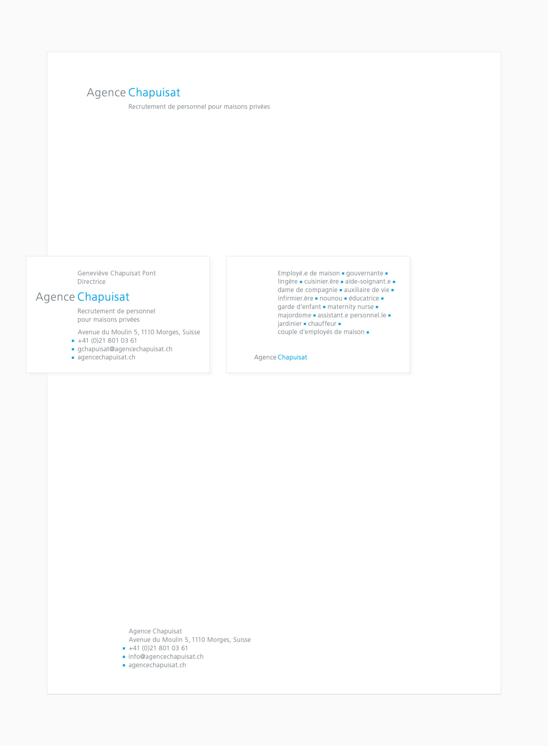
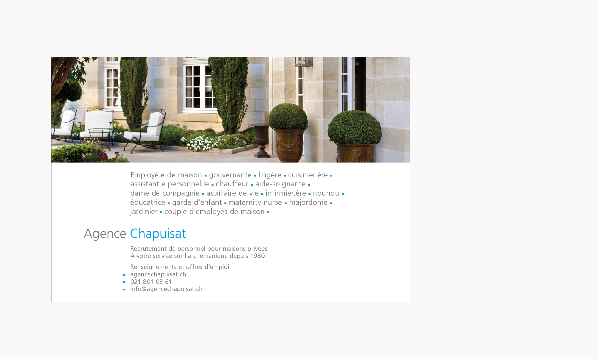
Agence Chapuisat
Logo
Typographic concept “Services”
Stationery system
Ad
Overview
The Agence Chapuisat has been active in domestic staff recruitment in Switzerland and abroad since 1980. The Agence Chapuisat was founded by Josiane Chapuisat and taken over by her daughter, Geneviève Chapuisat Pont.
Commissioned by the Agence Chapuisat, urs schmidt design has developed a visual identity that expresses both the specifics and values of the Agence Chapuisat, highlighting the work ethics and the quality of services that have built its reputation. Visual identity brings a timeless graphic solution available on every communication medium of the Agence Chapuisat.
Visual identity
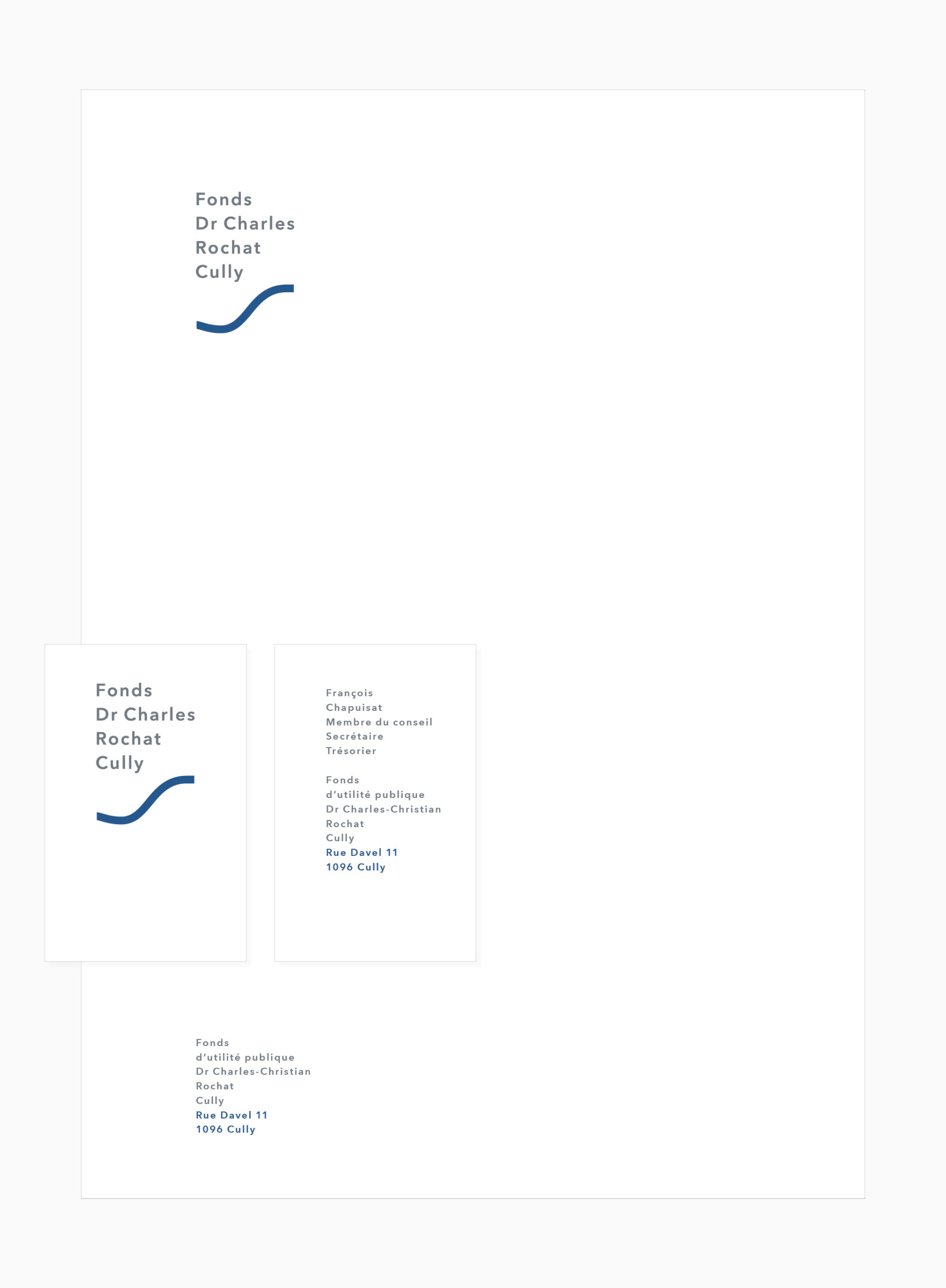
Fonds d’utilité publique Dr Charles-Christian Rochat Cully
Logo
Stationery system
Overview
The foundation «Fonds d’utilité publique Dr Charles-Christian Rochat Cully» was created in 1967. Its goals are to facilitate projects and to support institutions on and about the territory of local councils of Bourg-en-Lavaux and Forel, situated at the heart of the Lavaux terraced vineyards in Switzerland. The area is a UNESCO world heritage site. Located on the waterfront of Lake Geneva, Cully is one of five local councils of Bourg-en-Lavaux.
In order to bring better exposure to its action, the Board of trustees decided to create a visual identity and awarded the project to urs schmidt design. The geography of the site and in particular the waterfront in Cully was the main source of inspiration for the conception of a symbol for the «Fonds d’utilité publique Dr Charles-Christian Rochat Cully». Therefore, the link between the foundation and Cully is obvious and its visibility highly reinforced. The symbol associated with the clean typographical system constitutes this new visual identity. It has convinced the entire Board of trustees.
Visual identity
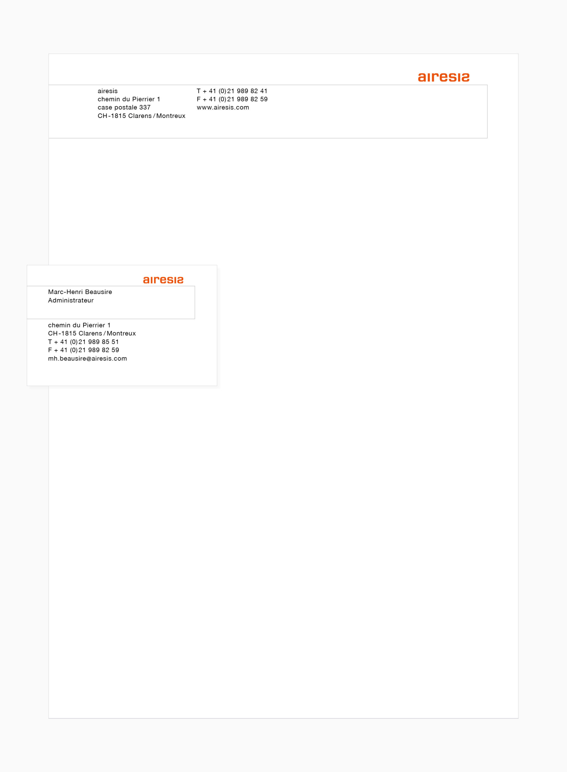
airesis
Logo
Stationery system
Overview
Founded in 2006, airesis is an investment company based in Montreux, Switzerland. The name is inspired by the ancient greek term “hairesis”, which originally meant “choice” or “the thing chosen”. With etymology as a starting point, the young company still needed to create the visual expression of the name.
The solution consists in the deliberate inversion of the second “s” character, which is somehow a typographic heresy. It reflects the ambition of the company to stress its difference. The colour definition of the logotype results from profound research together with the client. It adds to the originality of this company’s visual identity.
*
Visual identity
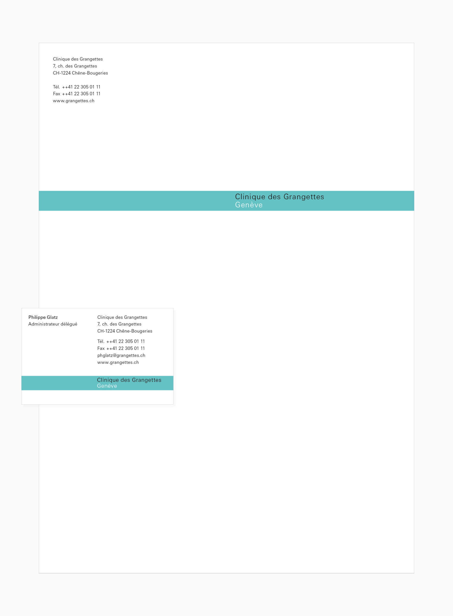
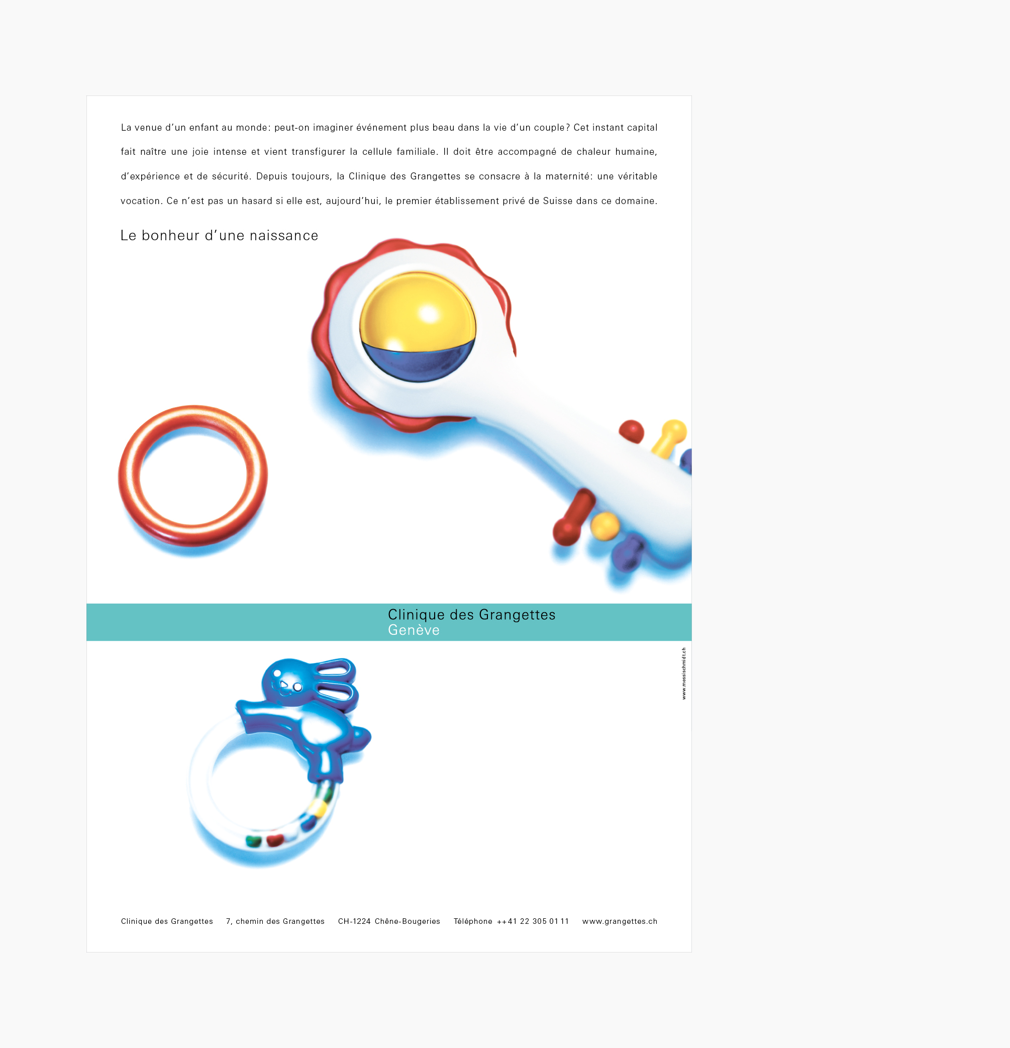
Clinique des Grangettes
Logo
Stationery system
Ad
Overview
Clinique des Grangettes is a private hospital renowned for its care, hospitality and hotel comfort, located in Geneva, Switzerland. For nearly a hundred years, Clinique des Grangettes has developed alongside the advances of modern medicine. Thanks to her experience, she now meets the highest performance and safety requirements.
Following the transformation of Clinique des Grangettes into a public limited company, a major modernization is being undertaken. To mark this transition, Clinique des Grangettes is committed to developing a new visual identity. As the visual expression of the modernization undertaken by Clinique des Grangettes, the new visual identity integrates perfectly with the setting of the hospital and on across all media.
In 2019, Clinique des Grangettes joins forces with Hirslanden Clinique La Colline in a joint venture. Since the merger, Clinique des Grangettes is under the visual identity of the Hirslanden group.
*
Visual identity
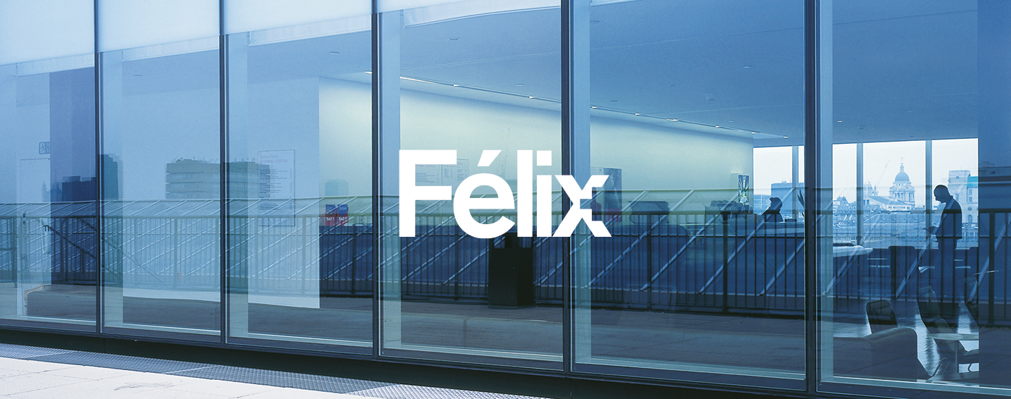
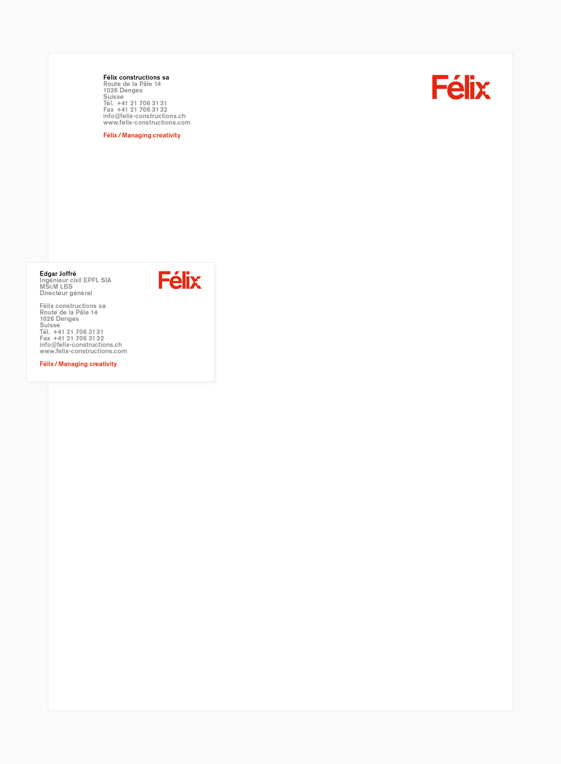
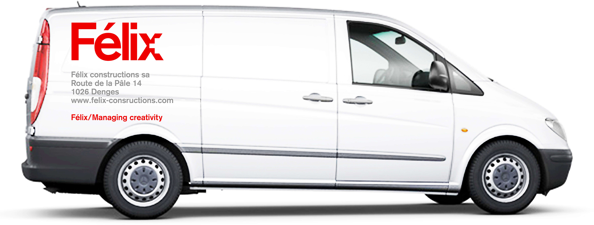
Félix constructions
Logo
Stationery system
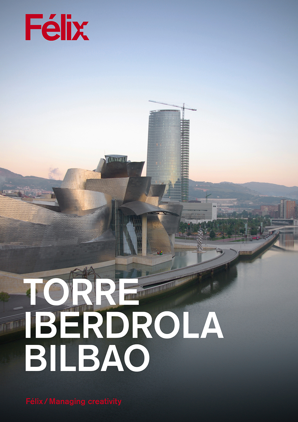
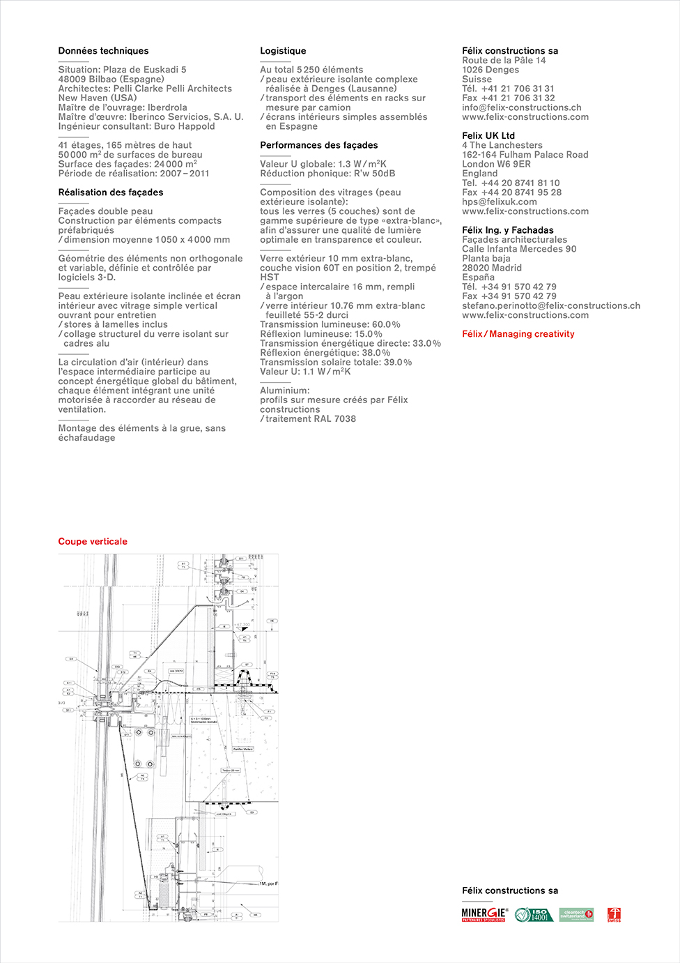
Project presentation
Véhicule
Overview
Félix constructions, founded in 1935 by Robert Félix in Lausanne, is specialised in the design and realization of highly complex and tailor-made facade systems. His son André took over in 1953 and developed extruded aluminium profile systems. Today, head office and production plant are located in Denges, near Lausanne, Switzerland, with offices in London and Madrid.
In 2014, a new management team arrived to reinforce the position of the company, facing a very competitive market. On this occasion, the corporate identity was revamped with the objective to include the Swiss cross in the new logo. This element is a reference to the Swiss know-how of the company, and to the world-famous “Swiss made” quality seal. The new logo, with its Swiss cross etched in the typographic design, perfectly answers the design brief as well as the design guideline which includes signage.
In 2020, Félix constructions has been taken over by Sottas SA. Since the takeover, Félix constructions is under the visual identity of Sottas SA.
*
Visual identity
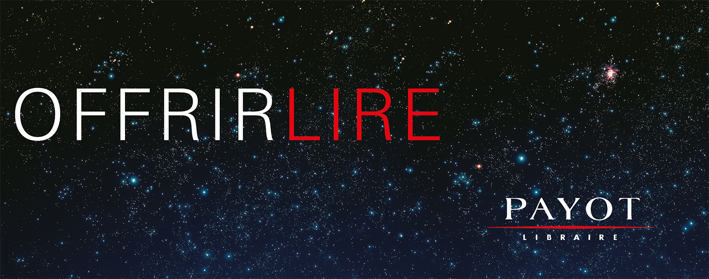
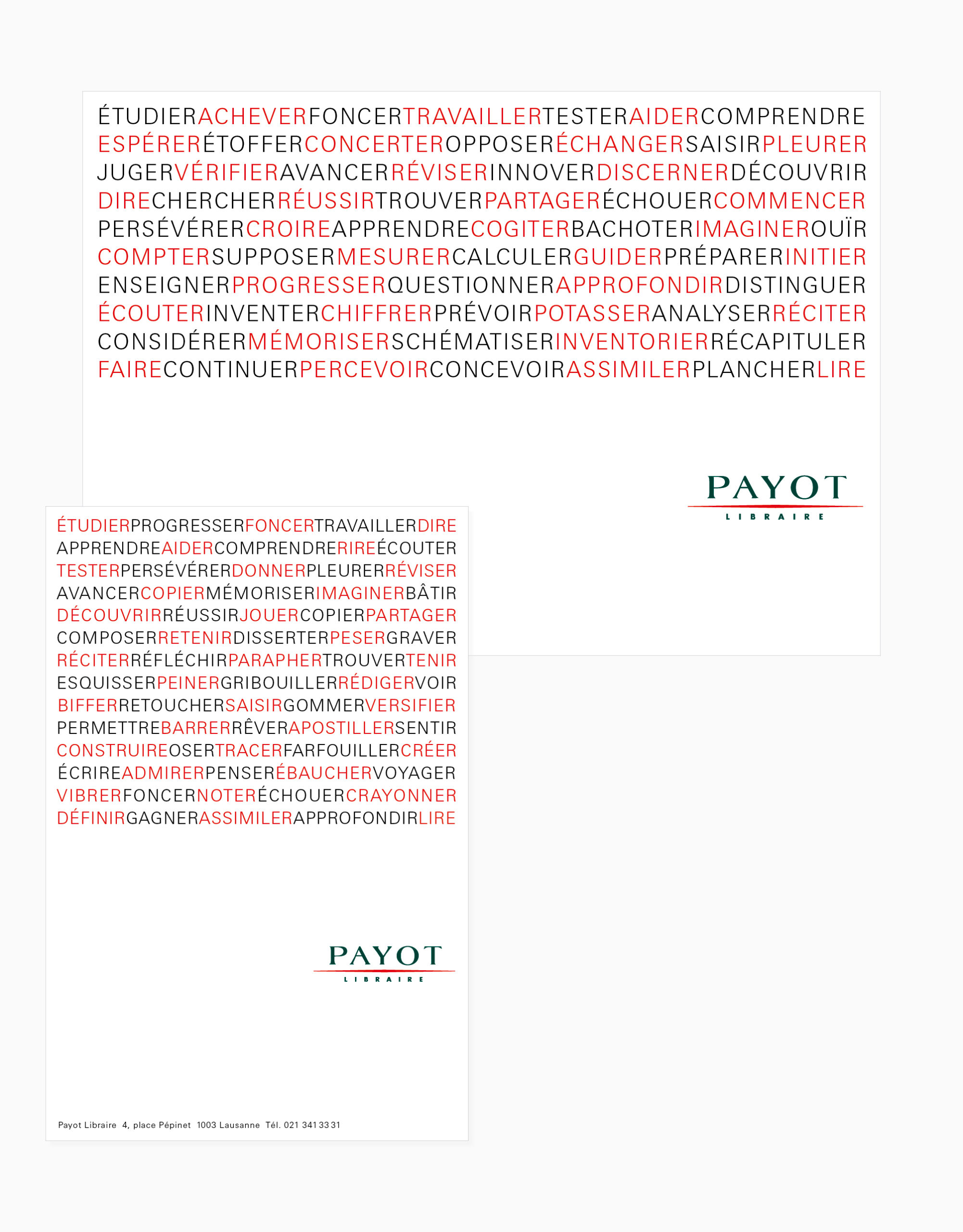
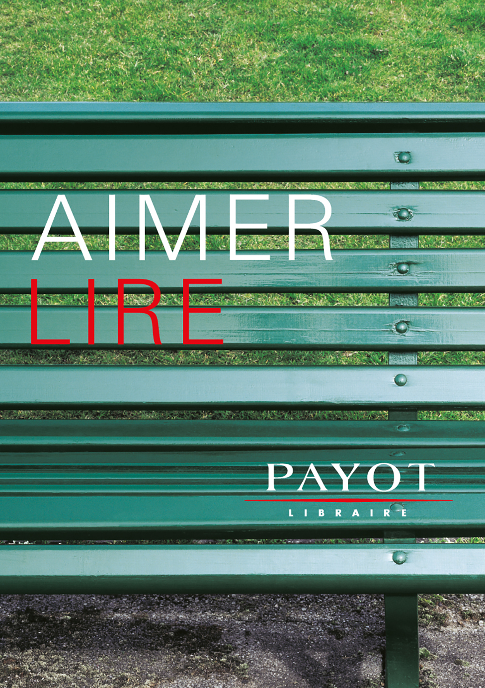
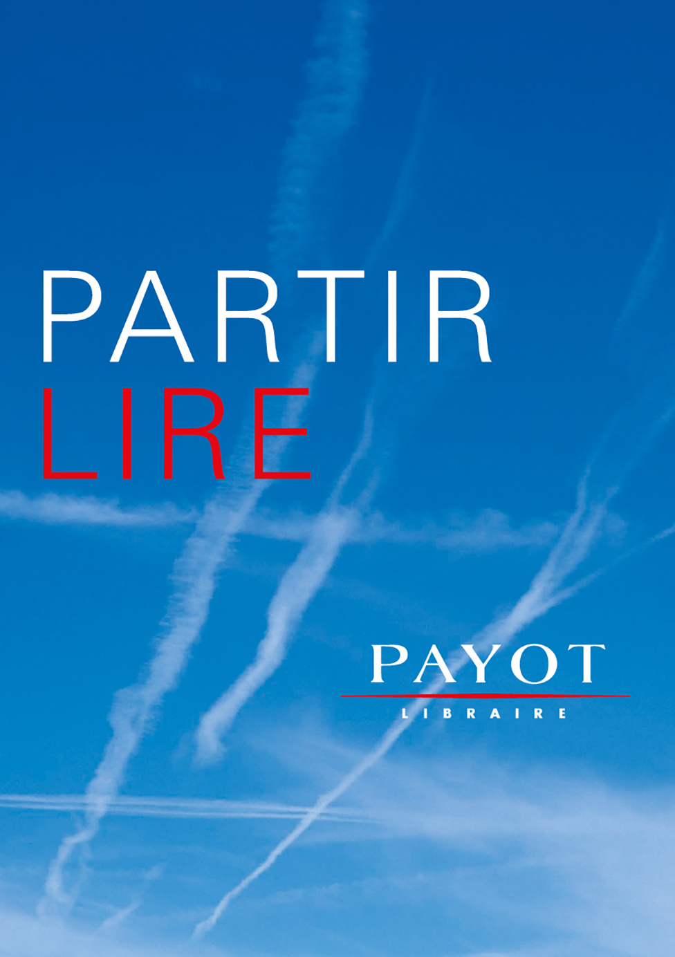
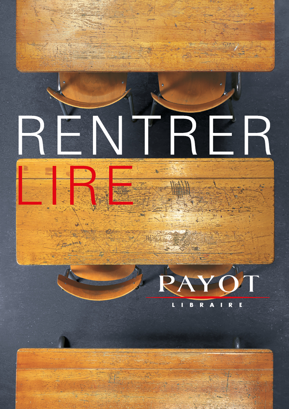
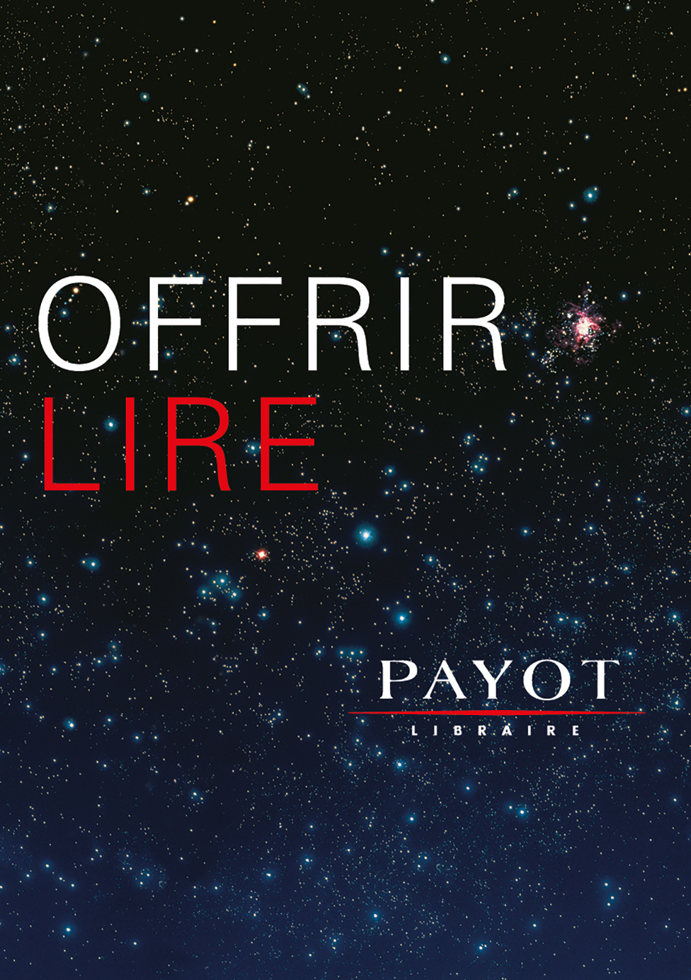
Payot Libraire
Typographic concept “Verbs”
Slogans
Ads
Posters
Overview
Payot Libraire is an independent Swiss company, the leading bookstores in French-speaking Switzerland. In order to keep this position, Payot Libraire has decided to undertake new ventures in communication.
To achieve this, a design guideline, based on a clear typographical principle has been developed. It integrates the communication concept “Verbs” that was also developed on this occasion. The design guideline was optimized up to its definitive version, which is in use today.